If you think Good design is expensive, you should look at the cost of BAD Design. - Dr. Ralf Speth
Citi Bank's biggest mistake in digital banking history was a UX blunder that cost the company $500 million.
It was a Wednesday morning in August 2020, and the lending operation at New York Citi Bank sent $900 million to multiple hedge funds on behalf of Revlon Inc. Citibank mistakenly transmitted the complete loan amount (interest and principal) to Revlon creditors using Flexcube software (as seen in the user interface below): $7.8 million in interest and $894 million in principal — for a total of about $900 million. Yes, you read that number right: $900,000,000.
At the heart of this blunder is a UX problem: The transfer's specifics were approved by three people in total or relies on ‘The six eyes’ protocol before it was sent. The process of sanctioning a high-value fund transfer begins with a ‘Maker’—typically a subcontractor —by filling in the information into Citi’s Flexcube loan processing system. A ‘Checker’ vets the transaction. The third and final step is when an ‘Approver’, the higher authority, confirms the transactions initiated by the two junior employees.The importance of conducting user research with the right target demographic cannot be understated. With MyParticipants, you can easily find the right participants for your user studies, so you can be confident that you're getting the insights you need to build a great product.Try MyParticipants today and get the insights you need to build a better product.
Since everyone agreed that it was accurate, it was authorized and dispatched. The software needed users to choose the FRONT, FUND, and PRINCIPAL checkboxes in order to override the default settings and make the transfer as intended (see screenshot above). The users believed that only one overwrite (PRINCIPAL) was required, though. None of them read the instruction manual, which outlined the proper usage.
When they realized what happened, they contacted support and asserted that the software must be defective. The bank then asked the lenders to return the money, but the lenders refused. The parties took the issue to court, where it was decided in February 2021 that Citibank only got $400 million back — a loss of $500 million.As you can see in the above picture, the user interface violated almost every design heuristic. This meant that end-users who were using the software had no way of knowing how to use it correctly or what they were doing wrong if they did not understand what they were doing wrong.
A confirmation display before carrying out a business-critical transaction such as "Are you sure you want to make a $900 million transaction?" may have prevented the lengthy, costly legal struggle between CitiBank and client that resulted in losing over $500 million. The user interface lacked any setup/ prompts for error prevention with the most basic question.In retrospect, Citi Bank’s multimillion-dollar debacle could have been avoided by running a usability test on its Flexcube interface. A mismatch between conceptual and mental models can lead to users making mistakes when using products or services due to a lack of understanding of how those products or services work or what their purpose is. For example, if someone does not know how something works, then they may try something out without knowing if it will actually work for them (and then get frustrated when it doesn’t work). If this happens repeatedly, then it can lead to feelings of frustration, which can cause the user to give up on using the product or service completely. This is especially true for technological products that require a learning curve before users become proficient with them.
This example from Citi Bank is a story about a real product that failed in the market without a good user experience. Like any generic story, it is meant to illustrate a point about product development: not paying enough attention to good user experience can have devastating business consequences. Paying attention to user experience is essentially about paying attention to end users and their needs framed by the purpose of the product. The best way to find out if your user interface is going to work for your target audience is to test it with a representative of that audience, observe how they interact with your product, or how they struggle with it.MyParticipants is an online platform that helps user researchers connect with the right participants for their studies. With MyParticipants, you can post your study requirements and receive responses from interested participants. MyParticipants makes it easy to find the right participant for your user research needs. Sign up today and get started recruiting!
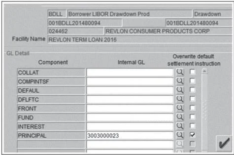
An image of the Flexcube UI, which was used for higher transactions by Citibank internal team. (Credits: Forbes)
MyParticipants is an online platform that helps user researchers connect with the right participants for their studies. With MyParticipants, you can post your study requirements and receive responses from interested participants. MyParticipants makes it easy to find the right participant for your user research needs. Sign up today and get started recruiting!
Join MyParticipants now to make your voice heard!
.jpg)


.png)

%20(741%20x%20839%20px)%20(1240%20x%202000%20px).png)


